
# 一、样式重置
# 1、浏览器默认样式
# 2、样式重置文件
为了解决各个浏览器间存在的默认样式问题,各种版本的样式重置文件 reset.css (opens new window) 随之诞生了。
而Normalize.css (opens new window) 是一种现代的、为 HTML5 准备的优质 reset.css 替代方案。
Normalize.css 作者在其博客中对其的相关描述 (opens new window)。
当然,使用 Normalize.css 的同时,我们也可以额外添加一些大厂的 reset.css(个性化、牛逼就对了)
自定义
/* reset.css样式重置文件 */
/* margin/padding重置 */
body,
h1,
h2,
h3,
ul,
ol,
li,
p,
dl,
dt,
dd {
  padding: 0;
  margin: 0;
}

/* a元素重置 */
a {
  text-decoration: none;
  color: #333;
}

/* img的vertical-align重置 */
img {
  vertical-align: top;
}

/* ul, ol, li重置 */
ul,
ol,
li {
  list-style: none;
}

/* 对斜体元素重置 */
i,
em {
  font-style: normal;
}
京东
* {
  margin: 0;
  padding: 0;
}

em,
i {
  font-style: normal;
}

li {
  list-style: none;
}

img {
  border: 0;
  vertical-align: middle;
}

button {
  cursor: pointer;
}

a {
  color: #666;
  text-decoration: none;
}

a:hover {
  color: #c81623;
}

button,
input {
  font-family: Microsoft YaHei, Heiti SC, tahoma, arial, Hiragino Sans GB, '\5B8B\4F53', sans-serif;
}

body {
  -webkit-font-smoothing: antialiased;
  background-color: #fff;
  font: 12px/1.5 Microsoft YaHei, Heiti SC, tahoma, arial, Hiragino Sans GB, '\5B8B\4F53', sans-serif;
  color: #666;
}
淘宝
body {
  color: #3c3c3c;
  -webkit-font-smoothing: antialiased;
  background-color: #fff;
}

body a {
  color: #3c3c3c;
}

body a:hover {
  color: #f40;
  text-decoration: none;
}

body a:focus {
  outline: 0;
}
携程
body,
figure,
h1,
h2,
h3,
html,
li,
nav,
p,
ul {
  padding: 0;
  margin: 0;
}

body {
  color: #000;
  overflow-x: hidden;
  -webkit-tap-highlight-color: rgba(0, 0, 0, 0);
  -webkit-text-size-adjust: none;
  -moz-user-select: none;
  max-width: 540px;
  margin: 0 auto;
  background: #f4f4f4;
}

body,
html {
  font: normal 16px/1.5 PingFangSC-regular, Tahoma, Lucida Grande, Verdana, Microsoft Yahei, STXihei,
    hei;
}

img {
  border: none;
}

a {
  color: #000;
  text-decoration: none;
}

h2 a:link,
h2 a:visited,
h3 a:link,
h3 a:visited {
  color: #fff;
}

li {
  list-style-type: none;
}
# 3、Normalize.css
css
├─ index.css
├─ reset.css   # 重置的CSS样式(可以去拷贝大厂的reset.css)
├─ common.css   # 公共的CSS样式
├─ variable.css # 待用的样式变量
└─ ……
- 安装使用 Normalize.css
// 安装
npm install normalize.css

// 使用
import 'normalize.css'
- 个人定制 css
当然,真实开发中,我们通常使用的是 css 预处理器
/* index.css */

@import './reset.css';
@import './common.css';
# 二、rem 多端适配
# 1、em 与 rem
相对于父元素的 em
浏览器默认的字体大小为 16px,若父元素没有设置 font-size 大小的话,那么1em = 16px。
如果父元素设置了 font-size 大小的话:1em = 父元素的 font-size 值
相对于 html 元素的 rem
通常情况下,浏览器默认的根元素字体大小是 16 像素(16px),那么1rem = 16px
也就是说,如果 html 元素中的 font-size 大小发生变化的话,项目文件中的所有 rem 都会跟着变化。
如论如何,都有 1rem = html 元素的 font-size 值
我们可以通过比较发现,使用 rem 单位通常用于建立相对于整个 html 文档的一致性,而不是相对于父元素的特定字体大小。
# 2、媒体查询
由此,我们可以通过为 html 设置动态的 font-size 基准值,从而实现了对不同尺寸设备的大小适配。
实现原理 ✍
假设设计稿为 750px 的二倍图,为了方便计算,可以把 @no 的值设置为固定的 15;这样 font-size 的初始值就变为了一个整数 25px。
动态的 font-size 基准值 = 动态的
设备宽度 / @no 份数
通过手动编写媒体查询,可以响应式的变化 font-size 基准值
代码实现
- common.css
html {
  font-size: 25px;
}

@media screen and (min-width: 320px) {
  html {
    font-size: 21.33333333px;
  }
}
@media screen and (min-width: 360px) {
  html {
    font-size: 24px;
  }
}
/* ============= */

@media screen and (min-width: 375px) {
  html {
    font-size: 25px;
  }
}

/* ============= */
@media screen and (min-width: 384px) {
  html {
    font-size: 25.6px;
  }
}
@media screen and (min-width: 400px) {
  html {
    font-size: 26.66666667px;
  }
}
@media screen and (min-width: 414px) {
  html {
    font-size: 27.6px;
  }
}
@media screen and (min-width: 424px) {
  html {
    font-size: 28.26666667px;
  }
}
@media screen and (min-width: 480px) {
  html {
    font-size: 32px;
  }
}
@media screen and (min-width: 540px) {
  html {
    font-size: 36px;
  }
}
@media screen and (min-width: 720px) {
  html {
    font-size: 48px;
  }
}
@media screen and (min-width: 750px) {
  html {
    font-size: 50px;
  }
}
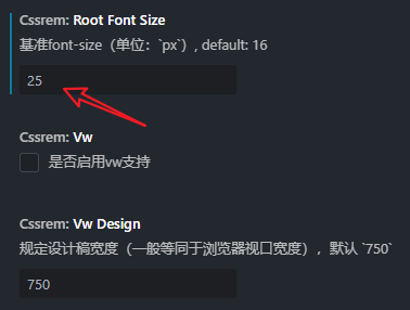
# 3、cssrem 插件
除之外,我们还可以使用 vscode 的cssrem (opens new window) 插件将 px 换行为 rem。
毕竟我们不能编写 css 代码时,时刻的手动的将 px 计算为 rem(虽然逻辑简单,就是 px / 25 = rem)
通过上面的媒体查询和 cssrem 插件,就可以实现一个手动的响应式方案。但是它的缺点也很明显:
- 手动编写媒体查询适配
- 必须使用 cssrem 插件开发
# 4、amfe-flexible ✨
在真实的项目开发中,我们可以使用另外一种基于 js 实现的自动化方案 —— amfe-flexible (opens new window)
实现原理
在前面的编写媒体查询中,@no 份数设置为了固定值 15。
在 flexible.js 中,@no 份数设置为固定值 10,所以其 font-size 的初始值为 37.5 px。
动态的 font-size 基准值 = 动态的
屏幕宽度 / @no 份数
flexible.js 通过 js 监听屏幕的变化,来响应式的变更 font-size 基准值。
安装:
npm install amfe-flexible
使用:
<!-- index.html -->
<html>
  <head>
    <meta
      name="viewport"
      content="width=device-width, initial-scale=1, maximum-scale=1, minimum-scale=1, user-scalable=no"
    />
  </head>
</html>
// main.js
import 'amfe-flexible'
# 5、postcss-pxtorem ✨
当然,还有与 cssrem 插件相对应的自动转换方案 —— postcss-pxtorem (opens new window)
在项目打包时,postcss-pxtorem 可以将所有的 px 自动转换为 rem
安装:
npm install postcss postcss-pxtorem -D
配置:
可在 vue.config.js、.postcssrc.js、postcss.config.js其中之一配置,权重从左到右降低,没有则新建文件
使用示例
-rootValue: 37.5 是计算出来的:假设 UI 给的是 750px 的设计稿(二倍图),前端使用的是 lib-flexible 适配库(默认 10 份),可以计算出 基准值 = (750/2) /10
- vue.config.js
module.export = {
  //...其他配置
  css: {
    loaderOptions: {
      postcss: [
        require('postcss-pxtorem')({
          rootValue: 37.5, // ( 750 / 2 ) / 10
          propList: ['*']
        })
      ]
    }
  }
}
- postcss.config.js
module.exports = {
  plugins: {
    'postcss-pxtorem': {
      rootValue: 37.5, //设置 font-size 基准值
      // 其他
      // rootValue(val) {
      //   return val.file.indexOf('vant') === -1 ? 75 : 37.5
      // },
      propList: ['*'] //使用范围
    }
  }
}
# 三、vw 多端适配
现在好的网站都开始使用 vw/wh 对网站进行重发布了。比较典型的有:
哔哩哔哩
# 1、rem 与 vw
相对于 html 元素的 rem
通常情况下,浏览器默认的根元素字体大小是 16 像素(16px),那么1rem = 16px
也就是说,如果 html 元素中的 font-size 大小发生变化的话,项目文件中的所有 rem 都会跟着变化。
如论如何,都有 1rem = html 元素的 font-size 值
相对于 视口 的 vw/vh
也就是说,如果 视口宽度发生变化的话,项目文件中的所有 vw 都会跟着变化。
如论如何,都有 1vw = 视口宽度 / 100
通过对比我们可以发现,vw/vh 的变化脱离了 html 文件,以视图为相对方的话,我们就可以不对相对方进行监听或调整。
TIP
就一句化,牛逼!!
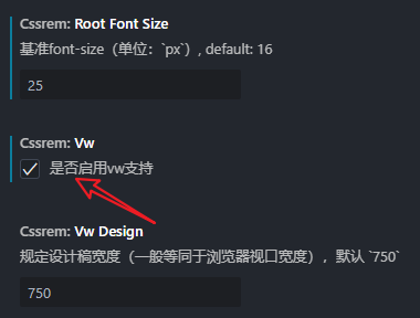
# 1、cssrem 插件
在移动端的 CSS 中使用 1vw,它将等于视口宽度的 1%,并且会根据用户设备的屏幕大小自动调整:
如果视口宽度为 375px,
1vw就等于375px * 1% = 3.75px
# 2、postcss-px-to-viewport
在项目打包时,postcss-px-to-viewport (opens new window) 可以将所有的 px 自动转换为 vw
下载:
npm install postcss-px-to-viewport -D
配置:
- postcss.config.js
module.exports = {
  plugins: {
    'postcss-px-to-viewport': {
      viewportWidth: 375 // UI设计稿的宽度
    }
  }
}
← 【vscode配置】 Axios请求封装 →