
TIP
在 HTML 中选择器的优先级为:
-!important > style="" > id 选择器 > 类/伪类选择器 > 标签选择器
# 权重
| !important | style="" | id 选择器 | 类/伪类选择器 | 标签选择器 |
|---|---|---|---|---|
| ∞ | 1000 | 100 | 10 | 1 |
# 默认样式重置
浏览器默认样式:
样式重置文件:
相比于传统的 CSS reset,Normalize.css (opens new window) 是一种现代的、为 HTML5 准备的优质替代方案。Normalize.css 作者在其博客中对其的相关描述 (opens new window)。
开发使用
- 安装使用 Normalize.css
// 安装
npm install normalize.css

// 使用
import 'normalize.css'
- 个人定制 css
当然,真实开发中,我们通常使用的是 css 预处理器
css
├─ index.css
├─ reset.css   # 重置的CSS样式(可以去拷贝大厂的reset.css)
├─ common.css   # 公共的CSS样式
├─ variable.css # 待用的样式变量
└─ ……
# 一、CSS 选择器
参考:https://developer.mozilla.org/zh-CN/docs/Web/CSS/CSS_Selectors
# 1、基础选择器
- id 选择器
#demo {
  border: red 2px solid;
}
- 类选择器
.spacious {
  margin: 2em;
}

/* 同时含有“spacious”和“elegant”类的 <li> 元素 */
li.spacious.elegant {
  margin: 2em;
}
- 标签选择器
a {
  color: red;
}
# 2、属性选择器 ✨
/* 存在title属性 */
a[title] {
  color: purple;
}

/* 属性值完全匹配的内容 --> 【 = 】 */
a[href="https://example.org"]
{
  color: green;
}

/* 属性值包含的内容 --> 【 *= 】 */
a[href*='example'] {
  font-size: 2em;
}

/* 属性值开头的内容 --> 【 ^= 】 */
a[href^='https:'] {
  font-style: italic;
}

/* 属性值结尾的内容 --> 【 $= 】 */
a[href$='.org'] {
  font-style: italic;
}
# 3、并集选择器
使用并集选择器的一个缺点是并集选择器中的单个不受支持的选择器会使整个规则无效化。
h1,
h2,
h3,
h4,
h5,
h6 {
  font-family: helvetica;
}
# 4、关系选择器
<ul class="first">
  <li>
    <div>Item 1</div>
    <hr />
    <ul class="second">
      <li>Subitem A</li>
      <li>Subitem B</li>
    </ul>
  </li>
  <li>
    <div>Item 2</div>
    <hr />
    <ul class="second">
      <li>Subitem A</li>
      <li>Subitem B</li>
    </ul>
  </li>
</ul>
/* 后代(关键字:子元素) */
/* 1、儿子 */
ul.first > ul.first // ["<li/>","<li/>"]

/* 2、直系 */
ul.first li // ["<li/>","<li/>","<li/>","<li/>","<li/>","<li/>"]

/* 兄弟(关键字:同父级、下铺) */
/* 1、🎈下铺——指定的兄弟 */
div ~ ul.second {
  color: red;
}
/* 2、下铺——第一个兄弟 */
hr + ul.second {
  color: red;
}
# 5、伪类选择器
# ① 常见的伪类 (opens new window)
首尾子元素
- :first-child
- :last-child
专注于任何子元素
- :nth-child(1) --- // 奇数 odd、偶数 even、表达式 an+b
- :nth-last-child(1)
专注于和父元素同类型的子元素
- :nth-of-type(1) --- // 奇数 odd、偶数 even、表达式 an+b
- :nth-last-of-type(1)
<ul>
  <p>title</p>
  <li>one-1-1</li>
  <p>title</p>
  <li>two-2-1</li>
  <p>title</p>
  <li>three-3-1</li>
</ul>
/* 1、子元素角度 */
ul > :first-child {
  background: yellow;
}

ul > :nth-child(1) {
  background: green;
}

/* 2、元素类型角度 */
/* 如果第三个子元素是 p 则进行css修饰*/
ul > p:nth-child(3) {
  color: pink;
}

/* 对第三个 p 子元素进行css修饰*/
ul > p:nth-of-type(3) {
  color: skyblue;
}
# ② 常见的伪元素 (opens new window)
提示
伪元素属于行内元素,但它们在文档树中是找不到的。
这两个伪元素一定要有
content属性配合使用
- ::before --- 匹配选中的元素的第一个子元素
- ::after --- 已选中元素的最后一个子元素
<!-- 图片遮罩层应用 -->
<head>
  <style>
    .tudou {
      position: relative;
      width: 500px;
      height: 200px;
    }
    .tudou > img {
      width: 100%;
      height: 100%;
    }
    .tudou::before {
      content: '';
      display: none;
      position: absolute;
      top: 0;
      left: 0;
      width: 100%;
      height: 100%;
      background: rgba(0, 0, 0, 0.4);
    }

    .tudou:hover::before {
      display: block;
    }
  </style>
</head>
<body>
  <div class="tudou">
    <div class="mask"></div>
    <img src="示例图片.png" alt="" />
  </div>
</body>
# 二、元素可见性
| 方式 | 值 1 | 值 2 | 缺点 | 占位 |
|---|---|---|---|---|
| disply | none(移除) | block | ||
| visibility | hidden(隐藏) | visible | ✅ | |
| opacity | 0(透明度) | 1 | 隐藏时仍可以触发事件 | ✅ |
# 三、CSS 盒子
# 1、盒子边界
提示
当 box-sizing 为默认时: width =
内容宽度当 box-sizing 为 border-box 时: width =
border + padding + 内容宽度,并且 width 不会被撑大
下面的案例中,我们引入了 scrollbar,可以看看对当前 css 盒子产生了什么影响?
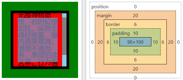
代码示例
::-webkit-scrollbar {
  width: 10px;
  background-color: skyblue;
}
::-webkit-scrollbar-thumb {
  background-color: grey;
}

#lencamo {
  position: relative;
  width: 172px;
  height: 172px;

  background-color: green; /*margin区域*/
}

#box {
  position: absolute;

  width: 100px;
  height: 100px;

  margin: 20px;
  border: 6px solid black; /*border区域*/
  padding: 10px;

  background-color: red; /*padding + 内容区域*/
}
<div id="lencamo">
  <!--   <div id="topBox" style="width:172px;height:20px;background-color:yellow;"></div> -->
  <div id="box" style="overflow:auto;font-size:15px;line-height:1;">
    无故寻愁觅恨,有时似傻如狂。纵然生得好皮囊,腹内原来草莽。潦倒不通世务,愚顽怕读文章。行为偏僻性乖张,那管世人诽谤!
  </div>
</div>
除此此外,还要上课 position 对当前两个盒子的影响
具体看下面的定位部分内容
# 2、background ✨
background 其实有更多属性供我们使用(是一个简写属性),但开发中我们常有的就那几个属性:
#app {
  /* 图片 */
  background: url('../assets/wavesBg.png');
  background-repeat: no-repeat;

  /* 纯色 */
  background: #de6561;
}
body {
  /* 开发应用👋 */
  background: url(./宫殿.png) no-repeat center / cover fixed;
}
经典应用:后台登陆页背景图
#iviewBg {
  width: 100%;
  height: 100vh;

  position: absolute; /* 经典应用 */
  top: 0;
  left: 0;

  background: url('../assets/wavesBg.png');
  background-repeat: no-repeat;
  background-size: cover;
  overflow: hidden;
}
另外,我们还可以额外的关注一下下面几个属性(与 background-image 相关):
/* 一、图像大小处理 */

#app {
  /* 宽高 | 纵横比缩放最小🎈大小 | 纵横比缩放最大🎈大小 */
  background-size: width height | cover | contain;
}

/* 二、图像位置处理 */

#app {
  /* xpos可以为长度值、百分比、center等 */
  background-position: xpos ypos;
  /* 此处需填写 fixed,默认值为 scroll */
  background-attachment: fixed;
}
object-fit ✍ 和 background-size 的区别
① object-fit
指定可替换元素(例如:<img> 或 <video>)的内容应该如何适应到其使用高度和宽度确定的框。
对象是 可替换元素(常应用于响应式设计中),用于控制元素内容的大小和裁剪
<div>
  <img :src="item.cover_image.url" class="cover-image" />
</div>

<style>
  .cover-image {
    width: 100%;
    display: block;
    object-fit: cover;
  }
</style>
② background-size
设置背景图片大小。图片可以保有其原有的尺寸,或者拉伸到新的尺寸,或者在保持其原有比例的同时缩放到元素的可用空间的尺寸。
对象是 背景图片(设置常规的固定背景图中),用于控制元素背景图的呈现方式
<div id="xx-box">
  <!-- <img class="cover-image" /> -->
</div>

<style>
  .xx-box {
    width: 100%;
    height: 100vh;

    background: url('../assets/wavesBg.png') no-repeat;
    background-size: cover;
  }
</style>
background-color 和 opacity 的区别
有时候我们需要使用 background-color 解决特点的透明色功能:
/* 不会影响到子元素 */
background-color: rgba(255, 255, 255, 0.5);

/* 会 影响到子元素 */
opacity: 0.5;
# 3、字体、文本
- 文本
关于在 textarea 文字换行、文字省略的应用示例 (opens new window)
line-height 注意事项
要谨慎使用 line-height,因为它会影响到该元素的高度,我们通常在下面几种进行下使用:
- 让单行文本垂直居中:将 line-height 设置为与行内元素的高度相等
- 改变多行文本的行间距:正常使用即可,块级元素中
text-decoration 说明
经典应用:
浏览器默认样式表 (opens new window) 默认对 a 标签加了下划线,但通常情况下我们并不需要。
/* 默认情况 */
a:-webkit-any-link {
  color: -webkit-link;
  text-decoration: underline;
  cursor: pointer;
}

/* 开发修改 */
a {
  text-decoration: none;
}
拓展内容:
text-decoration 其实是
text-decoration-line(线条) text-decoration-color(颜色) text-decoration-style(样式) text-decoration-thickness 的缩写形式(线条粗细)
p {
  text-decoration: underline wavy red; /* 红色下划波浪线 */
}
属 性 | 可 取 值 | 描 述 |
|---|---|---|
| text-align | left(默认值)、right、center、justify(多行文本) | 相对它的块父元素(文本包裹元素)对齐 |
| line-height | normal、number、length、% | 设置行高(多行文本的间距) |
| text-decoration | none(默认值)、underline(下滑线)、line-through(删除线) | 设置文本装饰性线条 |
| letter-spacing | normal、length | 设置字符间距 |
| word-break | normal(默认)、break-all(强制换行) | 处理单词换行方式 |
| white-space | normal(默认)、nowrap(不换行/仅单行)、pre-wrap(换行/且保留全部空格) | 处理元素中的空白 |
| text-overflow | ellipsis(省略号) | 设置超长文本省略显示 |
| overflow-y | scroll(滚动) | 设置超长文本滚动显示 |
word-break、overflow-wrap、white-space 解析
参考:彻底搞懂 word-break、overflow-wrap、white-space (opens new window)
- 换行方式角度
当文字超出包裹父元素的边界时,文字是会自动换行的,但是单词/字符串自动换行会存在一点瑕疵。
p {
  /* 强制换行🚩(长单词或长字符串等可能会被迫隔断) */
  word-break: break-all;

  /* 优雅换行 (万不得已绝不拆分长单词)*/
  overflow-wrap: break-word;
}
- 保留空格角度
详见 CSS 效果实现 的 white-space 部分笔记
- 字体
下面的某些效果也可以通过
<i></i>、<em></em>、<strong></strong>等实现
属 性 | 可 取 值 | 描 述 |
|---|---|---|
| font | font-style、font-weight、font-size、font-family | 在一个声明中设置所有的字体属性 |
| font-size | medium(默认)、xxem、xx%、xxpx | 设置字体大小 |
| font-weight | normal(默认)、bold、200…900(400=normal,700=bold) | 设置字体粗细 |
| font-style | normal(默认)、italic(斜体)、oblique xxdeg(倾斜) | 设置字体风格 |
| font-family | "Arial","Microsoft YaHei","黑体","宋体",sans-serif; | 设置字体类型 |
# 四、position 定位
# 1、参考文档
# 2、快速认知
| 名称 | 偏移 📌 | 是否占位 🎯 |
|---|---|---|
| static | 默认值 | |
| relative | 相对于原 static 位置 | 占位 |
| absolute | 相对于上级非 static 元素 | 不占位 |
| fixed | 相对于视口viewport | 不占位 |
| sticky | 粘性定位,可以实现切换效果 | 默认占位,滚动时变成 fixed 模式 |
# 3、position 应用
登陆页背景图(absolute)
#iviewBg {
  width: 100%;
  height: 100vh;

  position: absolute; /* 经典应用 */
  top: 0;
  left: 0;

  background: url('../assets/wavesBg.png') no-repeat;
  background-repeat: no-repeat;
  background-size: cover;
  overflow: hidden;
}
当然居中对齐最经典的是 flex 布局,下面我们演示的是使用 position 实现的居中对齐。
盒子居中对齐(父相子绝 + margin/calc)
<div class="parent">
  <div class="child"></div>
</div>
.parent {
  width: 600px;
  height: 600px;
  background-color: skyblue;

  position: relative;
}

.child {
  width: 100px;
  height: 100px;
  background-color: red;

  /* 方式1 */
  position: absolute;
  top: 0;
  right: 0;
  bottom: 0;
  left: 0;
  margin: auto; /* 🤔why */

  /* 方式2 */
  /*
  position: absolute;
  left: 50%;
  top: 50%;
  transform: translate(-50%, -50%); /* 相对于自己 */
  */

  /* 方式3 */
  /*
    position: absolute;
    top: calc(50%-50px);
    left: calc(50%-50px);
  */
}
盒子居中对齐(fixed + translate)
<div class="parent">
  <div class="child"></div>
</div>
.parent {
  width: 600px;
  height: 600px;
  background-color: skyblue;
}

.child {
  width: 100px;
  height: 100px;
  background-color: red;

  position: fixed;
  left: 50%;
  top: 50%;
  transform: translate(-50%, -50%); /* 相对于自己 */
}
# 5、sticky 应用
堆叠效果
- 以前
- 现在
<div id="container">
  <div><img src="https://picsum.photos/id/10/480/360" /></div>
  <div><img src="https://picsum.photos/id/11/480/360" /></div>
  <div><img src="https://picsum.photos/id/12/480/360" /></div>
  <div><img src="https://picsum.photos/id/13/480/360" /></div>
  <div><img src="https://picsum.photos/id/14/480/360" /></div>
</div>
#container div {
  position: sticky;
  top: 0;
}

/* =================== */

#container div img {
  width: 100%;
  height: 100vh;

  background-repeat: no-repeat;
  background-size: cover;
  overflow: hidden;
}
元素悬浮效果的实现(提示:配合 z-index 属性) 👀
动态搜索工具栏
经典的场景:淘宝 pc 端 (opens new window)
<div class="container">
  <div class="site-nav">
    <!-- 区域 -->
  </div>
  <div class="search-bar">搜索区域</div>
  <div class="content">
    <!-- 内容区域 -->
  </div>
</div>
.container {
  height: 1200px;
}
.site-nav {
  height: 50px;
}

.search-bar {
  position: sticky;
  top: 0;
  z-index: 100;

  height: 50px;
  background-color: skyblue;
}
# 五、常见的 CSS 函数
# 1、attr() (opens new window)
获取属性值
<p data-foo="hello">world</p>
<!-- 结果 -->
<!-- hello world -->
[data-foo]::before {
  content: attr(data-foo) ' ';
}
# 2、calc() (opens new window)
执行一些计算
.banner {
  width: calc(100% - 80px);
}
# 3、var() (opens new window)
插入一个 CSS 变量
:root {
  --main-bg-color: pink;
}

body {
  background-color: var(--main-bg-color);
}
# 4、url() (opens new window)
指向一个资源
.topbanner {
  background: url('topbanner.png') #00d no-repeat fixed;
}

ul {
  list-style: square url(http://www.example.com/redball.png);
}
# 5、counter() (opens new window)
计数器,和伪元素搭配使用
li {
  counter-increment: icounter;

  position: reactive;
  /* …… */
}
li::after {
  content: counter(icounter);

  position: absolute;
  /* …… */
}